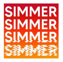
My work points to the inherent power of written language and how letters act as vessels of communication which have meaning bound to them. I aim to subvert this power by using the letter forms as visual tools to create an image that exclusively looks to form and shape, predominately using screen printing to do this. I play with whether the viewer reads my work or sees it as a visual image by layering letters, repeating them, twisting or breaking them apart. An essence of language remains but the letters are no longer bound to their understood meaning, pushing the boundaries of how long a letter’s function remains to the viewer.
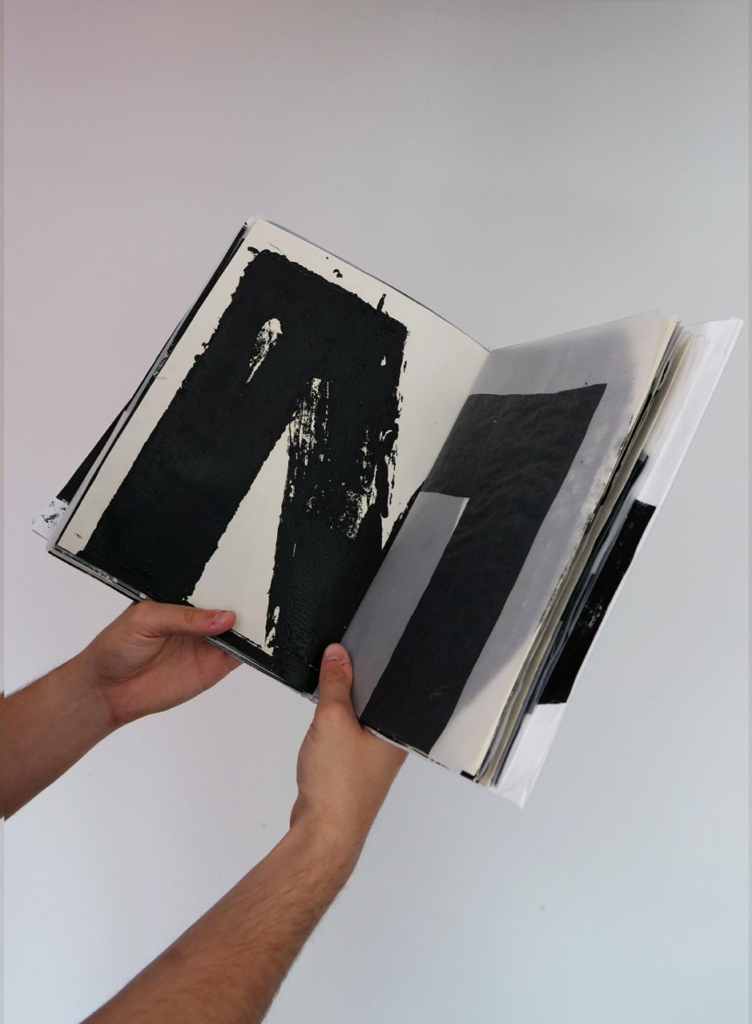
Printing as a medium is important to my practice as it allows me to reference the wider dissemination of written communication. New forms can be created through layering, and I see each piece as a new shape created from the rigid, recognisable structures of the letters. Alongside screen printing, I have begun woodblock printing. Having created only four differently shaped woodblocks, I am able to construct every letter of the Roman alphabet and most punctuation. Breaking the structure of our written language into these four shapes was very powerful to my practice, re-iterating concepts around repeated shapes, over printing and appreciation of form.
By using the material of language as a visual tool, I align my work with concrete poetry practices. Hansjorg Mayer’s printed type poems and Derek Beaulieu’s books such as ‘Aperture’ (2019) both deconstruct or manipulate the recognisable images of letters and have been of key interest to me. The emphasis on clean lines, geometricized forms and reduction are all focuses of my practice, which was further driven forward by looking at Tauba Auerbach’s Components drawings.
The balance between recognisable language and purely abstract shape is something my work straddles, ensuring that an impression of language remains accessible. There feels as if a message is just out of reach, something for the viewer to decode, whilst also being a study in shape and the strength of impression. Colour is also something I consider, looking to how this may heighten or change the overall impression of my prints. Black text on a white background was something that inherently referenced the printed word, with this being an instantly recognisable form for written language to take.
I disrupt the process of reading but do not leave it behind completely. Through reading psychological models on the process of reading, such as the E-Z model by Reichle and the Dual Route Cascaded model by Coltheart, I have discovered that by de-contextualizing and abstracting singular letters, the brain’s routes of understanding both the semantic and the phonological aspects of the letter is likely disrupted. Therefore, the viewer is forced to acknowledge the processes of recognition and understanding that usually come as second nature whilst reading. They are drawn into spending an unnatural length of time deciphering the meaning of the parts they recognise but can’t access, emphasising the distinct geometric visual strength of the forms and subverting their literary power.
image: Cryptographic Alphabet, 2020. Mixed media artist’s book, screen print and woodblock print on paper, acrylic paint on tracing paper, 300 x 225 x 43 mm
Instagram: @cathmorganart
Website: www.catherinemorganart.wordpress.com